It is extremely important for designers and developers to take into consideration on how well they are going to use the barest minimum of the available screen space to display their business’s major features and content and remain valuable for the mobile users. Usability and functionality are the main factors that can make or break the overall success of your mobile website. If your website isn’t responsive, “amplified” and A/B tested, it will look good on desktops and laptops, but what they will look on mobile phones, you can’t even imagine.
To help you make a website which is high on usability, here are few steps put together by a renowned Ecommerce Website Designing Company in Phoenix, Etoile Info Solutions.
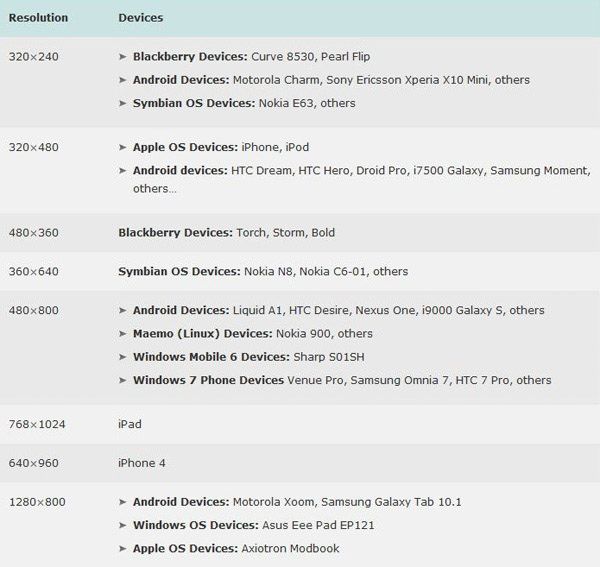
Decide Screen Resolution
How will you ever going to decide what should be there on the site or not, if you have not decided on the screen resolution? Your mobile website should work smoothly, without hampering the design and functionality on the wide range of possible mobile devices. You need to make a perfect balance between the appropriate screen size and the size of your audience. Make a list of specifications of various mobile devices, their screen size and resolution and then use your best judgment to create one display which will be compatible across all screen sizes.
Know your customers: In order to decide what functionality and what content you are going to put into your mobile website, you need to know what your customers really want from you. The best way to achieve that is by conducting few usability tests or how well your website is doing on usability by letting some users use your standard website. This will help you gather crucial information on what users would like to see when coming to your website.
Don’t go overboard: “Simplicity is the key”. In this case usability is the key to effective usability. Let them explore the website without any conundrum. Try to keep your website free of any tables, frames and other complex formatting features. It should be a much simpler version of your desktop site, with unique and bold buttons, less graphics and a less complex navigation system. In case you are using padding, just make sure you are using it on a minimum side, which is far less than what you’d use for a normal website.