Earlier the problem wasn’t really that prominent because of the minimal nature of web design and development technologies that were being used. Today the internet is filled with abundant of different web design layouts and development languages that have made the gap between the two all the more distinct. Though used interchangeably, when explained separately, both the terminologies do present the users with different elements of the human-computer interaction and this is what we are going to talk about and deconstruct these terms word by word to reach to the utter depths of their meanings.
Before we get down to the task, laying out strikingly dissimilar differences between the two terms a result-oriented agency offering seo services in Phoenix Arizona would first like you to understand the meaning of the two terms.
What is User Interface?
User Interface (UI) design is the large and evolving arena. Theoretically speaking, it is the amalgamation of different website content (text, images, videos, webinars, documents, etc), form (Buttons, headings, labels, text fields, menu, navigation bar, drop-down lists, check boxes, graphic design, etc), and user behavior (What will happen if I click/check/drag, type etc).
It takes a lot of experience, keen attention to detail, a lot of practice, and a lot of user testing to get to the core of successful user interface design. Being a user interface designer requires your senses to visualize and practices to mold according to what the users deem qualified of being a flawless and perfect user interface design. A top-notch and highly converting user interface revolves around the boundaries of engaging, interactive, aesthetically magical and emotionally driving to make your products more lovable and beautiful and website all the more approachable.
Read Also: What is Session Replay?
What I see an idle way of going about developing a user interface design is to visualize the entire product buying experience a sort of journey, which presupposes visiting a website all the way to the final check out page. Every user that takes on the task of downloading your app from the abundant of other apps available in the App Store/web, all the way through using it, completing a plethora of tasks and perpetrating goals within an app view this as a journey and that journey needs to be delightful and streamlined one.
What is User Experience?
Surfaced in the late 1990s, the term user experience was conceived by cognitive scientist Don Norman when he was assisting the Advanced Technology Group at Apple as vice president.
Here is how he defined user experience,
“‘User experience’ encompasses all aspects of the end user’s interaction with the company, its services, and its products.”
Also Read: Explore the World of AR and VR with Google’s Open Library “Poly”
Basically, user experience carries with itself a broad range of disciplines that primarily circumnavigates around user’s easiness to smoothly explore the nooks and crannies of a website or an application. User experience as visualized by many isn’t only the visual interaction between your product and a user. This concept covers varied dimensions of the entire journey a person takes while exploring the depths of your application.
UX compasses the following customer journey facets,
- The complete process the user has to go through to reach to your company’s product.
- The string of actions users carries out in order to interact with the product interface.
- The pool of emotions and reactions that arise when they try to accomplish a particular task.
- The first impression (which can also be the last) they take away from the first journey they took of your application.
UX designers are responsible for weaving out product layout that successfully delivers a product or service that fulfills the expectations and needs of the customer along with ensuring that they able to accomplish their goals seamlessly and smoothly.
What differentiates User Interface from User Experience?
Now, it is really hard to pinpoint differences between the two terms, though we have chalked about definitions and the elements that make up these two terms, stating differences between the two terms is literally like asking the difference between a pizza and the ingredients with which a pizza is made, or the difference between a water bottle and the material with which a water bottle is made.
UI and UX are different to the point that UI is the structuring of individual digital interfaces, while UX encompasses designing and structuring the overall consumer experience or the journey from the initial app download or website visit to the final product checkout page.
Read Also: Everything You Need To Know About Cybersquatting/ Domain Squatting
In a nutshell, UI is the part of UX, but that simply doesn’t imply that UI is a small and meager part of the UX. Both the jobs are big enough that neither can be accomplished with the successful implementation of the either. Revolving around both the terms are the different concerns, objections, tasks and different skills and mindsets. User experience is responsible for answering the bigger questions that are, why are people coming to your site? What do they want to do and how are you going to help them to do it? A user interface, on the other hand, is trying to give answers to these important questions by developing interactive and seamless digital interfaces to make a emotional connection with a user. Research is a vital part when it comes to designing user experience, this is the only way of knowing what makes a user tick, which interactions can bring out the desired reactions from the users and thereby build easiest, engaging and streamlined interactions. Both the UX and UI designers have somewhat similar goals to accomplish.
- The final product is living up to the expectations of the user/ customer.
- The final product is liked by the user/ customer.
- It is the user who’ll use the product, not the designer, so it is quintessential to determine how the user will engage with the products and services, not the other way round.
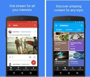
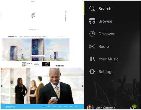
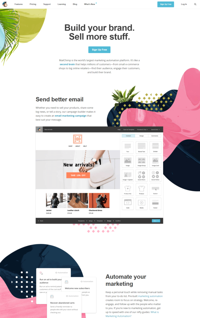
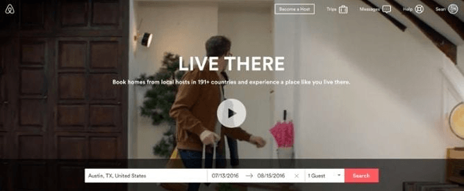
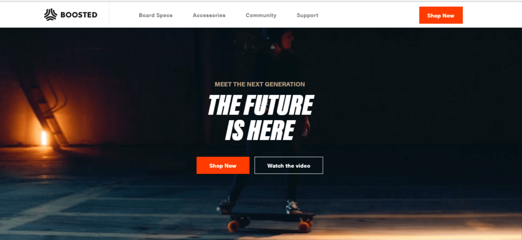
Websites with Great UI


