Mobile devices over the last few years have seen a tremendous growth in regards to usage. 80% of internet users today own a Smartphone and users spend on average 69% of their media time on Smartphones. A typical Smartphone with sufficient battery life and powerful wifi can bring users a world full of valuable and infinite information. We all are living and breathing in a world full of mobile phones and since every user today owns a mobile phone, it is our responsibility to optimize it for unhindered and better user experience. Now, how can you give users stellar UX and UI experience on a small screen without overloading it? Though the world of mobile apps is filled to the brim with multiple options to bring such change, as a leading Website Designing Company, we consider Typography in Mobile Apps the most important one.
Mobile design requires a significant amount of detailing, intricacy, and elaboration due to its limited screen size. The User Interface of mobile apps is made up of different elements, mainly smooth navigation bars, and tab buttons, side sliding menus, along with some aesthetic and graphic elements to highlight these elements. But even with the incorporation of these visuals elements, we keep the users hooked by communicating with them in a most traditional and roundabout way, i.e. via text. Communication plays a pivotal role in mobile design. No matter how and where you are developing your mobile app, it should clearly portray their intent and purpose. The objective of developing a mobile application is crystal clear, to develop a connection between the app and the user and help a user find what they are looking for in an app.
According to sources, 95% of communication over the internet is via text. Unfortunately, web designers are focusing on every major design element but this. Here an acclaimed Web Development Company in Phoenix Arizona AZ is talking about a field that has redefined over the years and typography has become a major design element in mobile apps.
What is Typography?
Going by Wikipedia’s apt definition,
“Typography is the art and technique of arranging type to make written language legible, readable and appealing when displayed. The arrangement of type involves selecting typefaces, point sizes, line lengths, line-spacing (leading), and letter-spacing (tracking), and adjusting the space between pairs of letters (kerning). The term typography is also applied to the style, arrangement, and appearance of the letters, numbers, and symbols created by the process.”
Why is Typography so important in Mobile Apps?
- The role of typography is not just limited to filling up the spaces in the mobile apps, but to aesthetically complement the overall mobile application design. This will significantly empower the overall user experience and will increase user’s amazement within the app.
- Typography plays a vital part in triggering human psychology and doesn’t restrict only to being a graphic contributor. With right and effective choice of typography, it becomes easier for the app users to connect with the overall app usability.
- It is a matter of fact that great design captures the attention of a user in a blink, but to prolong that attention, typography plays a very quintessential role. That is why it is must to build a typographic hierarchy which is a part of the visual hierarchy in the designing context which guides the user attention and helps them explore an application.
- When typography done right, it can help communicate better with the users. You can win trust and attention of the users with the selection of typography that gels well with the overall app design. You can highlight important details with typography and encourage users to take actions through words.
What are the best practices in mobile typography?
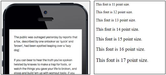
Font Size: Let’s talk about Apple’s take on this. Apple in its website devoted to developers has clearly mentioned that “Your font will be no good if users can’t read it, no matter if it’s the most beautiful font in the world.” According to the Cupertino multinational technology company, font size ranging from 11 to 17 points is apt for iOS devices and 35 and 50 characters per line, which is somewhere close to what needs to be done in Android Apps. The screen of mobile phone ends, before they can even start, so use them wisely.
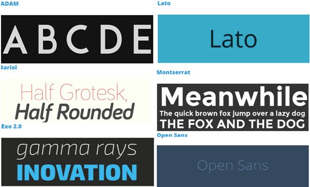
Font Style: The selection of font style says a lot about your mobile app and what you are trying to portray with it and it is something which is often sidetracked or simply plucked from the library. The type of font style you are selecting largely depends on the type of content you want to display. This is because fonts can express really well. Opt for curvier and thinner fonts and kick aside over-decorative and gaudy fonts that look shabby on a small screen. Below is the list of the best free mobile fonts to use for your design projects.
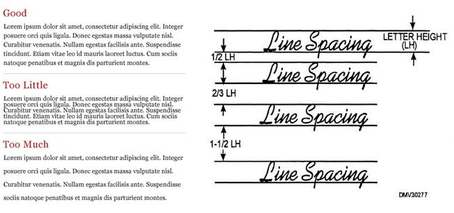
Leading: In the typography context, leading is the space between the baselines of consecutive lines of type. Since there is major screen size issue with mobile phones, leading is significantly smaller than desktop versions. Leading in mobile phones should be a little bit tight as compared to the desktop. Too much wider and shorter leading can entirely break the overall user interface of your mobile app. In mobile phones, the standard leading should be 120% the point size of the font.
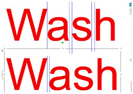
Kerning: It is defined as the “distance between two letters”. It is the process of adjusting the distance between the characters. It isn’t something that is too important in the large space of typography, but definitely worth the attention. If you notice clearly, you may witness that sometimes the letter spacing between capital letters may lead to inconsistent kerning as compared to the spacing between lowercase letter. So divert your attention to this problem and maintain the space visually even.
If you would like to add something to this list, feel free to drop it in our comments box below.
