Small details and functions on your website can make a huge impact on the overall functioning of your website. How well you are structuring and labeling your website navigation will determine how well your website will perform in the eyes of your target audience. Proper website navigation is important because,
It can affect the website traffic: Website navigation is a determining factor for search engines to rank your website which is again an important factor when talking about the website traffic because you’ll get good traffic only when you’ll rank high on search engines.
It can affect conversions: The more complex a website, the more it will be difficult for customers to navigate thus lower conversion of potential leads into customers.
Here are 4 superlative trends you need to watch out in 2018.
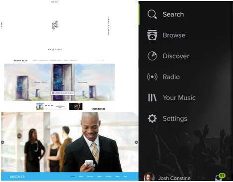
MENU is the heart of your website: It is through a menu that you reach the deep ends of a website and navigates different web pages meant for the user perusal. Menus can be placed in different locations of your website like header, footer, sidebar and numerous other locations. The location of the menu should depend entirely on the type of website you have, the idea is to choose a website that works the best for your website. There are numerous types of website menus like
- Interactive navigation.
- Sidebar static navigation
- Navigation in websites which are parallax powered
- Hamburger menu
- Multimedia-based menu
- Centered layout Navigation
- Huge dropdowns
- Footer navigation
The font, color combination and the design of the menu should also be such so as to be clearly visible to the visitors.
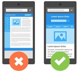
Website Navigation on Mobile Devices: With the increased demand for smartphones it is now very rare that people boot up their laptops or open their desktops to browse. Almost 50% of people these days use mobile phones to visit a website or mobile applications. So it is important that you pay an undeterred attention on the navigation of the mobile layout of a website. But that doesn’t mean you can entirely transform the mobile navigation, it has to be similar to what website navigation offers.
The order matters: Yes, the number and order of the items listed on the website navigation are also crucial. The items that are at the top and at the extreme bottom are the most impactful because this is where the maximum engagement and user retention lies. This phenomenon is known as the serial position effect, which is the end result of two cognitive biases.
Primacy effect: Items at the top of the list are easily remembered.
Recency effect: Items at the bottom of the list are easily remembered.
So make sure the items you want users to check surely lies in those particular areas, if of course, the list is long, otherwise, the best practice is to add only important and must-have items on the list, so that all come across as important ones.

Make Important Links Visible: A website is composed of multiple web pages. So, it is quintessential that your place important links to your website at an appropriate location where they are easily visible. If the web pages you want visitors to know about are available in the form of relevant links on your website, then the chances are that they’ll not reach your visitors that you intend to.